 LinkedIn
 X
X Custom Sections: Enhancing the Connection UI in an SDK Connector


When building connectors on the Boomi Enterprise Platform, the connector-descriptor.xml plays a key role; it defines how the platform dynamically builds the user interface for creating connections and operations. With recent updates to the Connector SDK and platform, developers now have the flexibility to design custom sections within the connection configuration. This means you can group related fields into separate, clearly labeled tabs, each with its own summary—making the UI cleaner and easier to navigate.
What’s new and why it matters:
- UI-Specific Design: Sections are purely UI constructs; organizing fields into Sections has no impact on the underlying connection functionality or how fields interact with endpoints.
- Component XML Preservation: Using Sections does not alter how component details are stored in the component XML, ensuring backward compatibility.
- Enhanced Organization: Grouping fields logically into intuitive sections, drastically improves the user experience when configuring complex connectors.
Until now, all connection fields were packed into a single default tab, which could get overwhelming for complex connectors. Let’s take a closer look at how this new capability works and how you can use it to streamline your connector UIs.
Implementing Custom Sections
As a connector developer, you can now incorporate one or more optional <section> elements in your connector-descriptor.xml. When configured with sectionType="page", these sections render as distinct tabs in the connection UI.
Section Element Attributes
- id: (Required) Unique identifier for the section. Must be alphanumeric and can start with a letter or underscore. Can contain underscores, hyphens, and periods. Must be unique across the entire descriptor.
- sectionType: (Required) Currently only supports the value
page, which renders as a tab in the UI. - title: (Required) Text applied to the tab and header of the screen.
- helpText: (Optional) Instructional text to guide users in configuring the section.
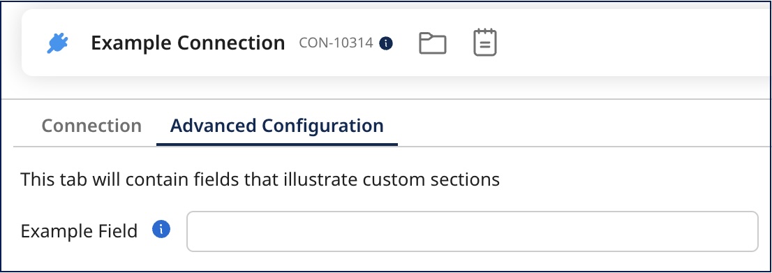
Here's how to define a custom section in your connector-descriptor.xml file:
<section id="advancedConfig" sectionType="page" title="Advanced Configuration">
  <helpText>This tab will contain fields that illustrate custom sections</helpText>
</section>
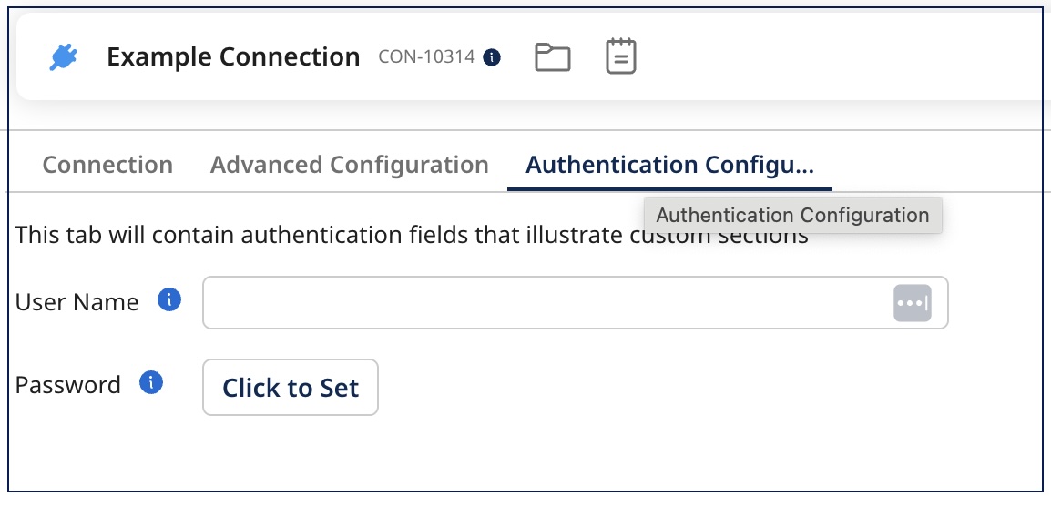
While the maximum title length is 40 characters, tab titles display only the first 20 characters followed by an ellipsis (...). Users can view the full title by hovering over the tab.
Assigning Fields to Sections
To place a field within a custom section, add the sectionId attribute to the field definition, matching the id of your defined section.
<field id="field id" label="Example Field" type="string" sectionId="advancedConfig">
    <helpText>The helptext for example field.</helpText>
</field>
If a field doesn’t have a sectionId, it’ll show up in the default Connection tab. But if all your fields are assigned to custom sections, that default tab won’t be shown at all. Just like fields, the order of sections in the UI follows the order you define them in the connector-descriptor.xml file.
With those settings in place, you’ll see something like this:
Configuring Multiple Sections
This sample descriptor showcases a structure that incorporates various sections, along with fields that may not be categorized under any specific section:
<GenericConnectorDescriptor requireConnectionForBrowse="true">
   <!-- Define a custom section for a new tab titled Advanced Configuration -->
 	<section id="advancedConfig" sectionType="page" title="Advanced Configuration">
		<helpText>This tab will contain fields that illustrate custom sections</helpText>
	</section>
	<!-- Define another custom section for Authentication settings -->
  <section id="authenticationConfig" sectionType="page" title="Authentication">
      <helpText>This tab will contain authentication fields that illustrate custom sections</helpText>
  </section>
  <!-- Fields that will appear in the section titled Advanced Configuration -->
  <field id="field id" label="Example Field" type="string" sectionId="advancedConfig">
    <helpText>The helptext for example field.</helpText>
  </field>
  <!-- Fields that will appear in the Advanced Settings tab -->
  <field id="username" label="Username" type="integer" sectionId="authenticationConfig">
  </field>
  <field id="password" label="Password" type="password" sectionId="authenticationConfig">
  </field>
  <!-- Field that will appear in the default tab since no sectionId is defined-->
  <field id="Generic Field" label="Generic Field" type="label">
      <defaultValue>Sample Text</defaultValue>
  </field>
  <!-- Operations and other elements -->
</GenericDescriptor>
Here is how this would render in the UI:
Best Practices
- Group related fields together in the same section to improve usability. Aim for 3-7 fields per section; consider splitting sections with more than 10 fields.
- Use concise, meaningful titles that accurately describe the section's purpose and contained fields.
- Provide clear instructions in the optional
helpTextattribute to guide users through configuration. - Sections appear as tabs in the order they're defined in the XML. Consider the natural configuration workflow when determining section order.
- You can still use visibility conditions within sections to show/hide fields based on other field values.
Technical Considerations
- Currently, only the
pagesectionType is supported, which renders as a tab in the UI. - While sections are limited to a maximum of three sections, each section can contain an unlimited number of fields.
- Sections cannot be nested within other sections.
- Section elements must be defined before the field definitions in a descriptor.
- Field ids must be unique regardless of which section they belong to.
- Fields not placed within a section will appear in the default Connection tab.
- Visibility conditions can be applied to fields within sections but not across sections.
Adding custom sections to your connector configuration can really elevate the user experience. Grouping related fields into logical sections makes the setup process feel more intuitive and less overwhelming—especially when dealing with complex connectors. Instead of placing all fields in a single tab, you can break things down into separate, focused tabs that are easier to navigate. This not only reduces clutter but also helps users quickly find what they need without getting lost. With a cleaner layout and fewer fields on each screen, everything becomes easier to read, understand, and configure. It’s a small change in structure that can make a big impact on how smoothly users interact with your connector on the Boomi Enterprise Platform.
So go ahead—clean up those cluttered tabs, group your fields with purpose, and build a better configuration experience. Happy sectioning!
